CI
Corporation Identity
In this way, the name “MAP” embodies the company’s commitment to creating the highest value by combining the artistry of architectural design with the technological expertise of plant engineering, all grounded in craftsmanship.
It is a concise expression of the company’s identity, which pursues a perfect harmony of professionalism, creativity, and technological excellence
Corporate Color
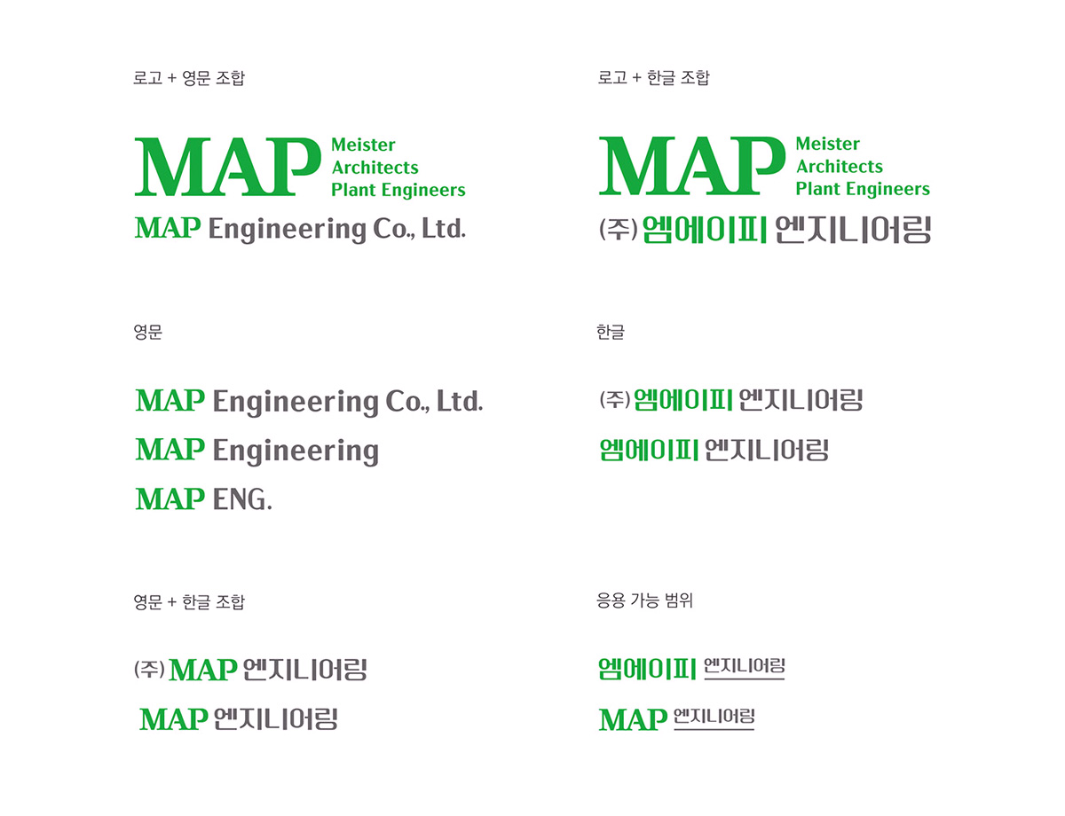
The colors of the MAP CI are centered on Green, symbolizing the value of eco-friendly architecture, and Gray, representing professionalism.
Together, they reflect the values of a professional engineering company dedicated to a sustainable future.
